PRODIGY FOOTBALL ACADEMY
Logo & Brand Identity
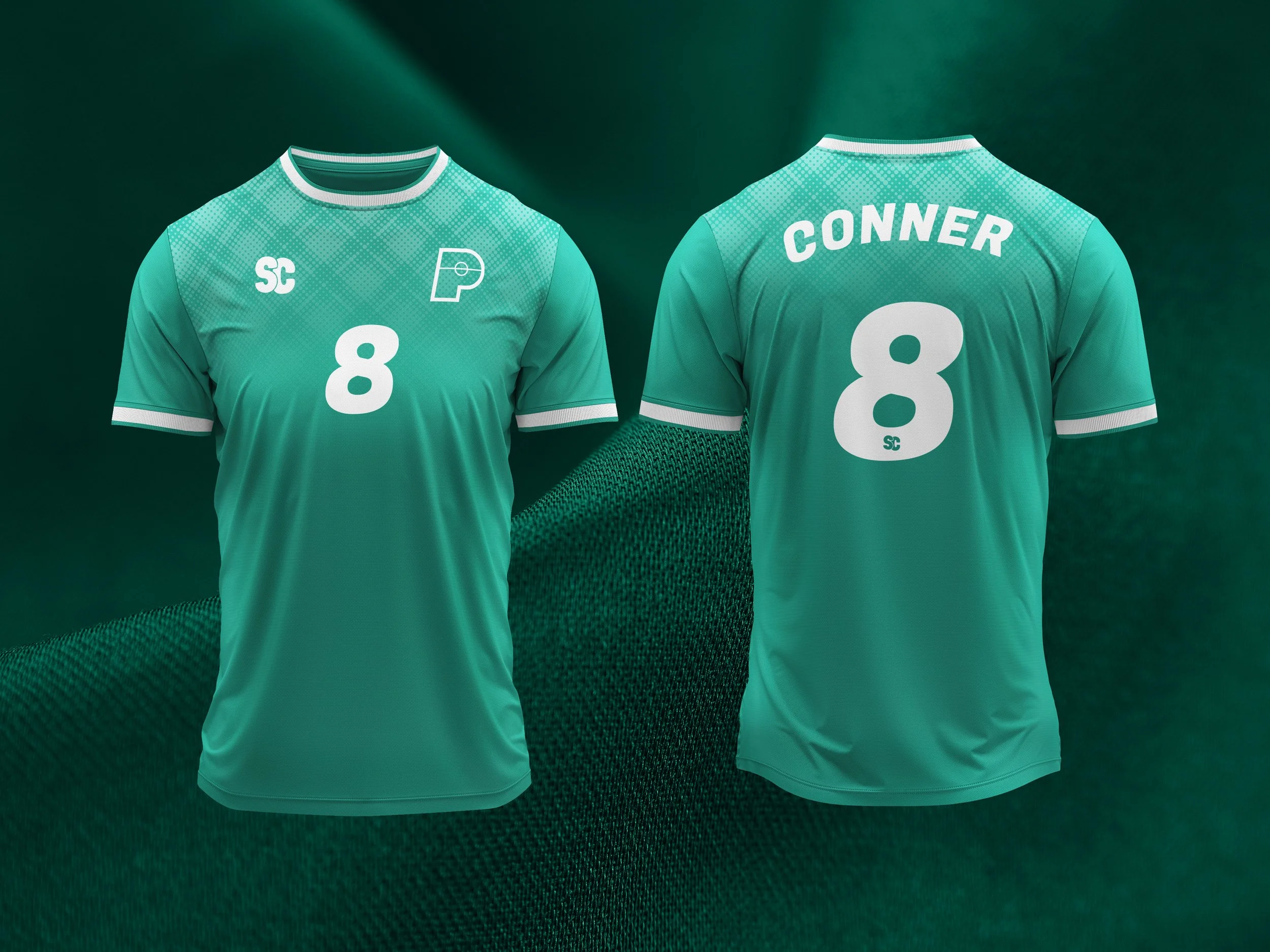
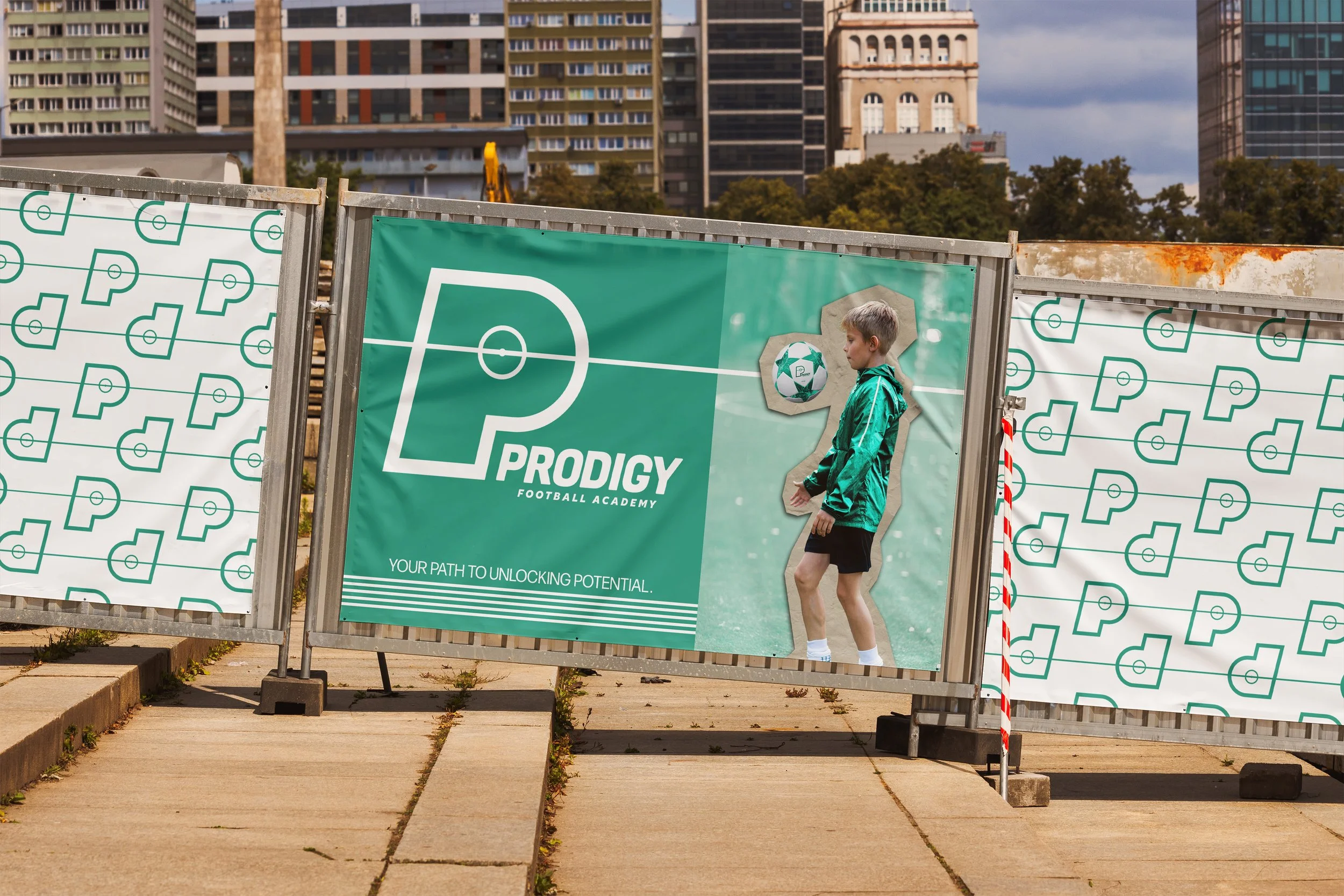
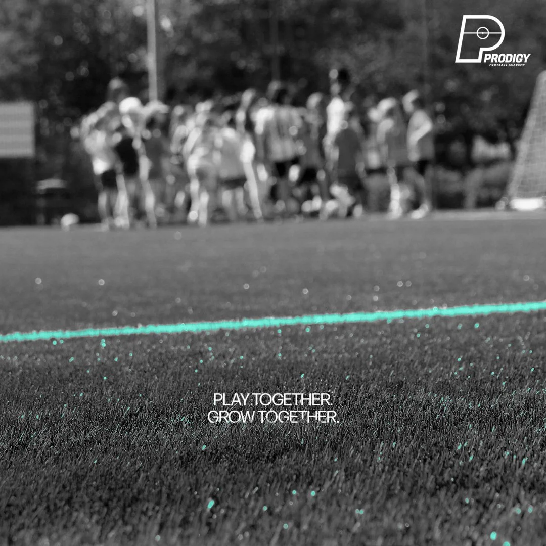
Prodigy Football Academy is a passion project that combines my love for football and brand design. I set out to create a modern and inspiring identity for a Scottish coaching organisation aimed at young players, focusing on growth, teamwork and a genuine love for the game.
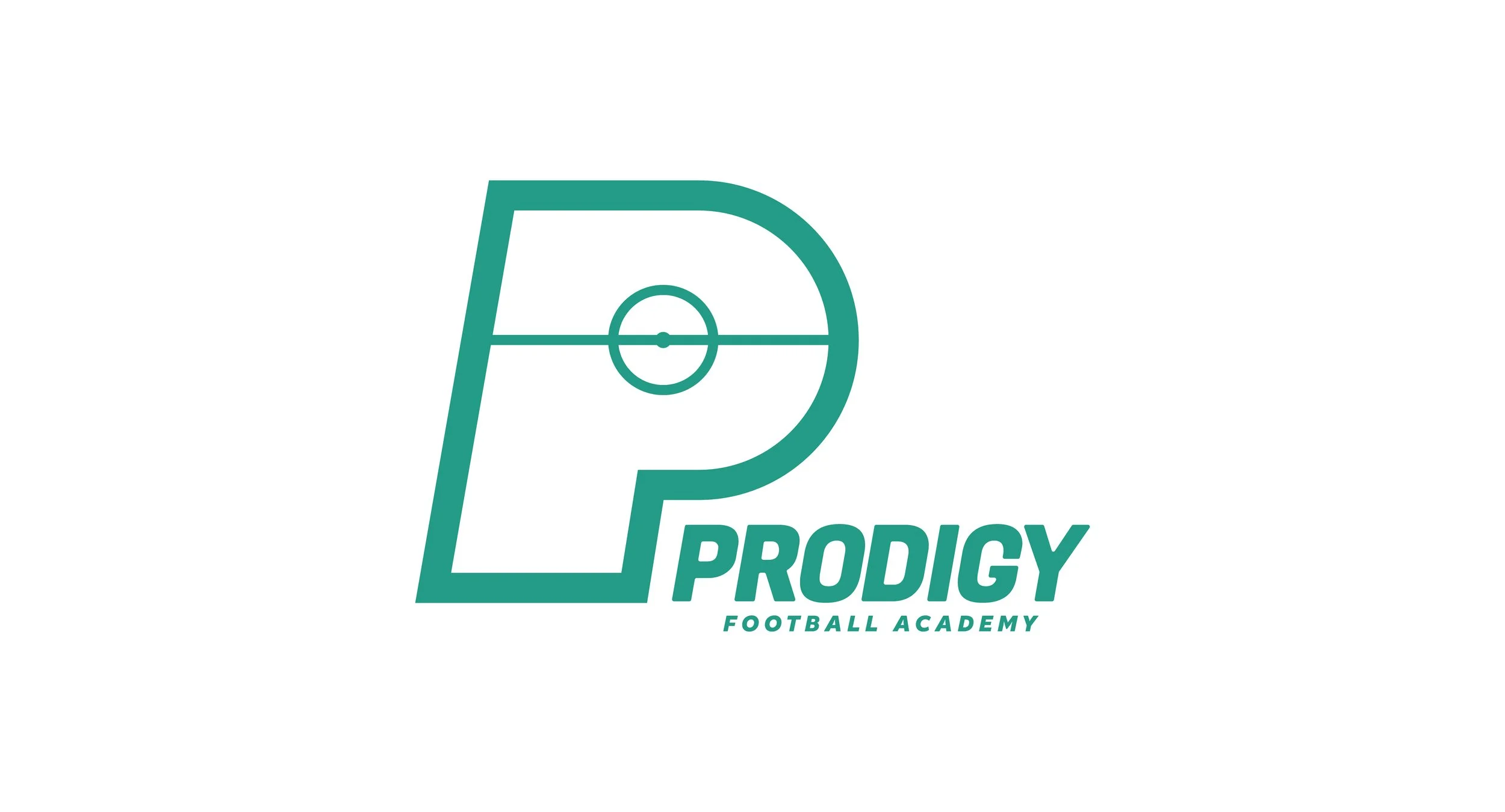
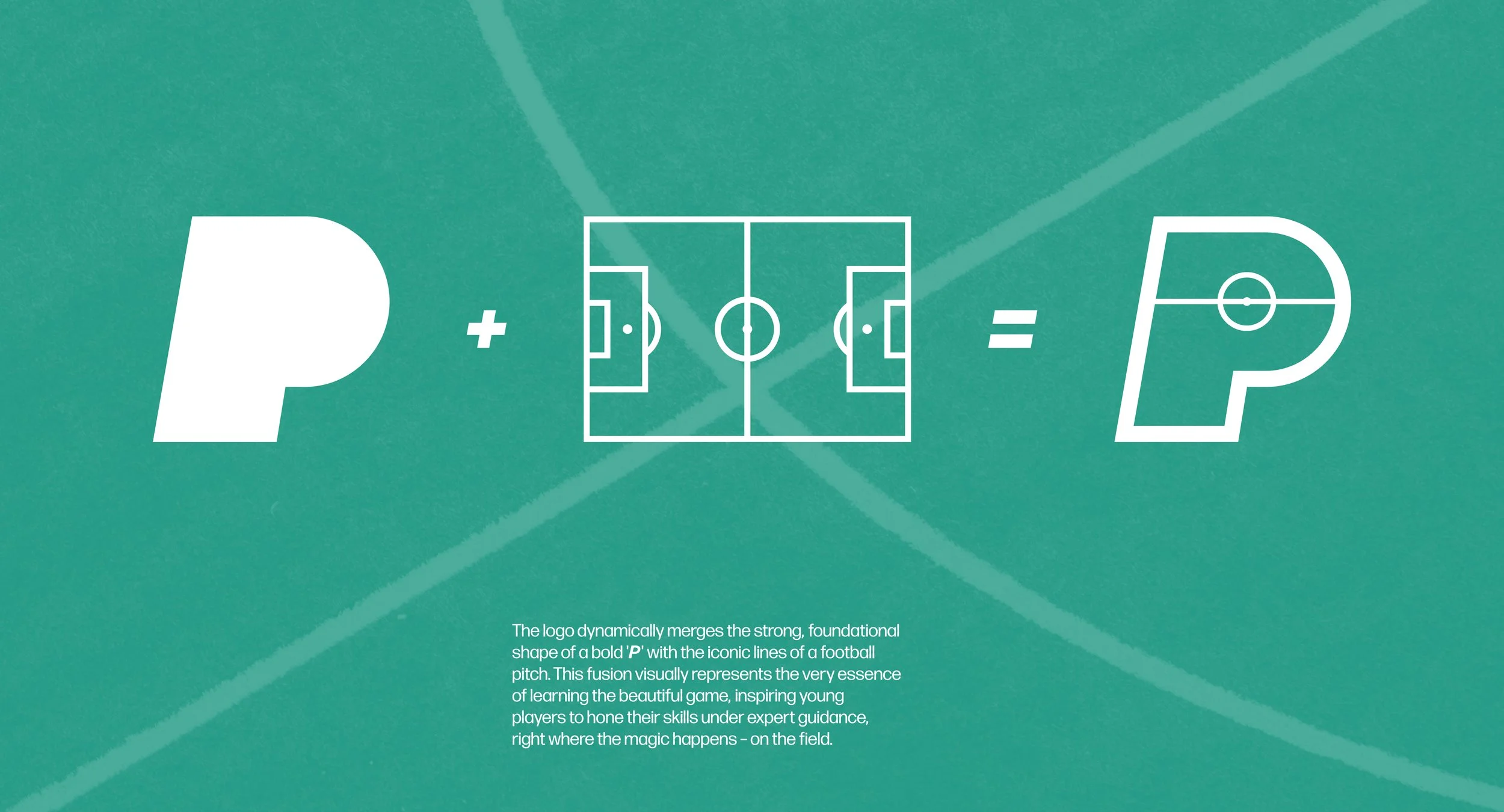
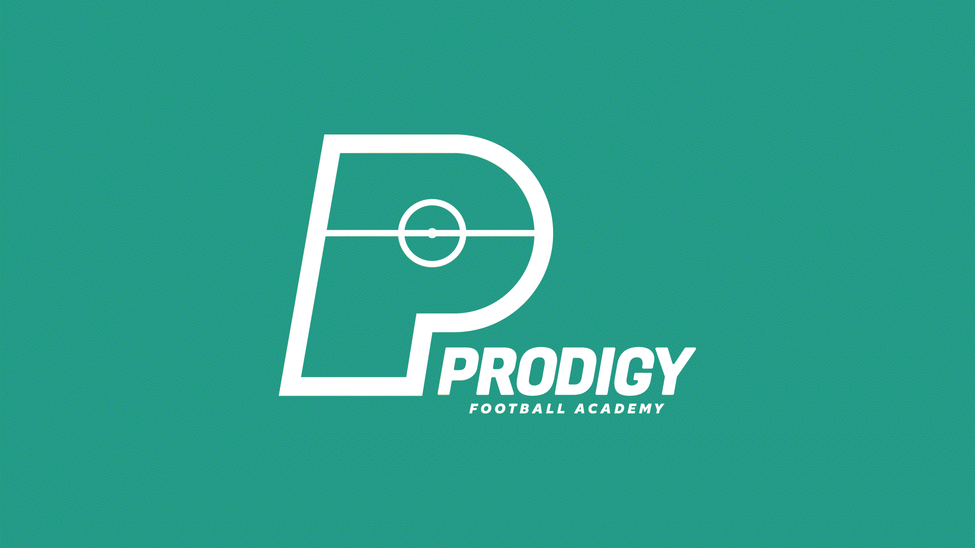
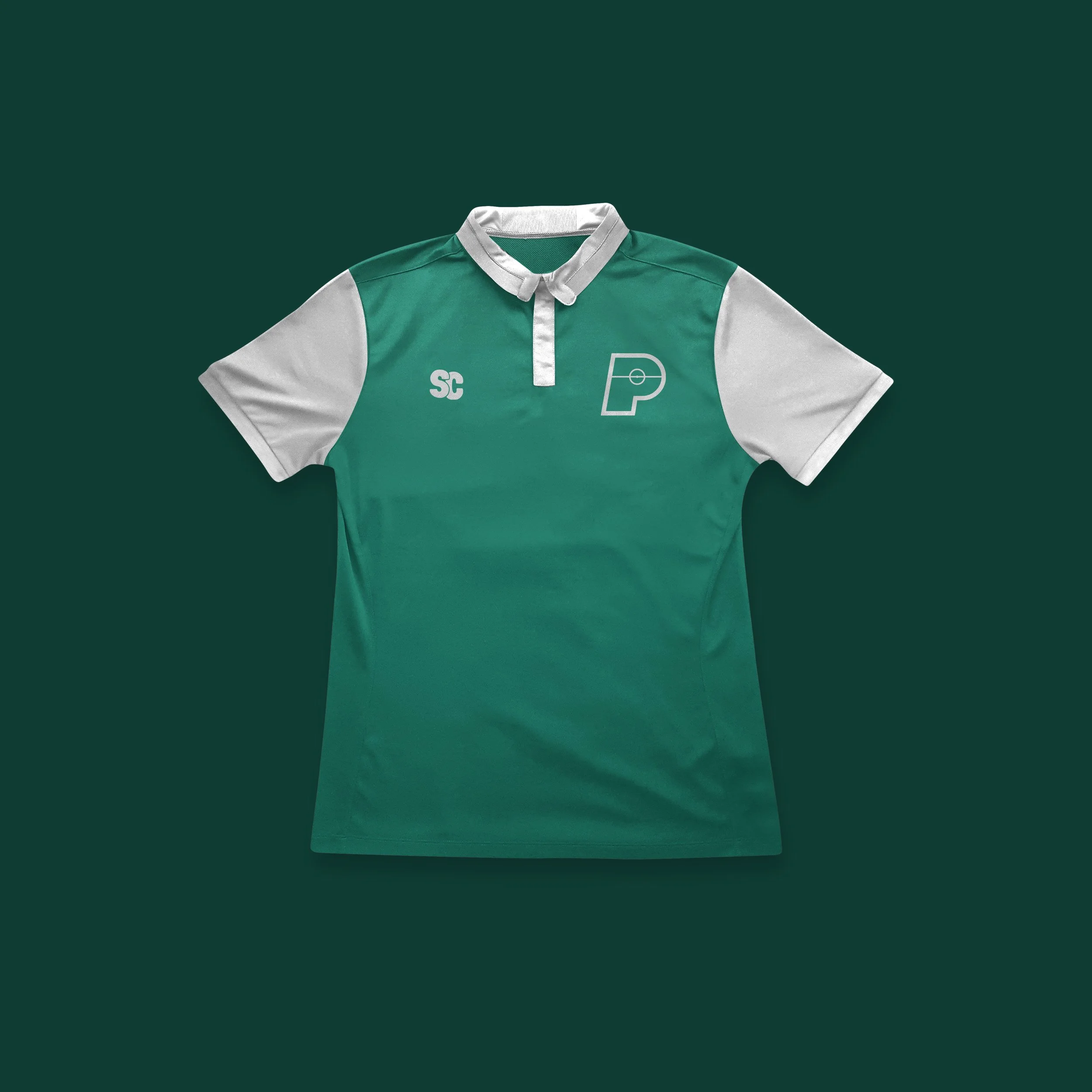
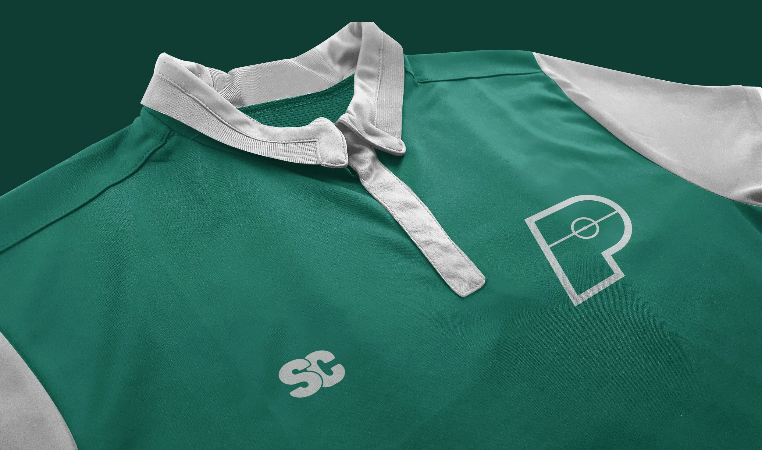
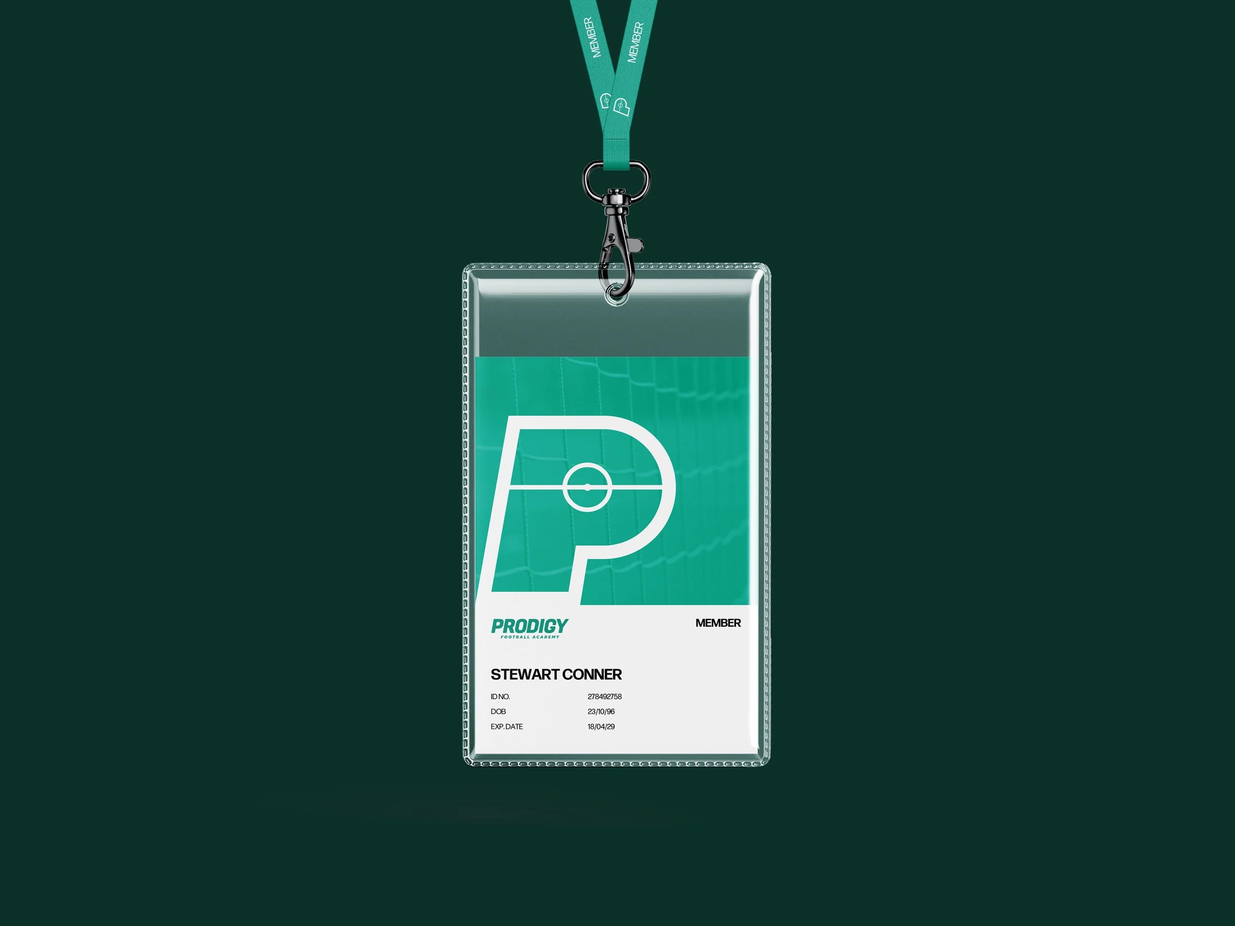
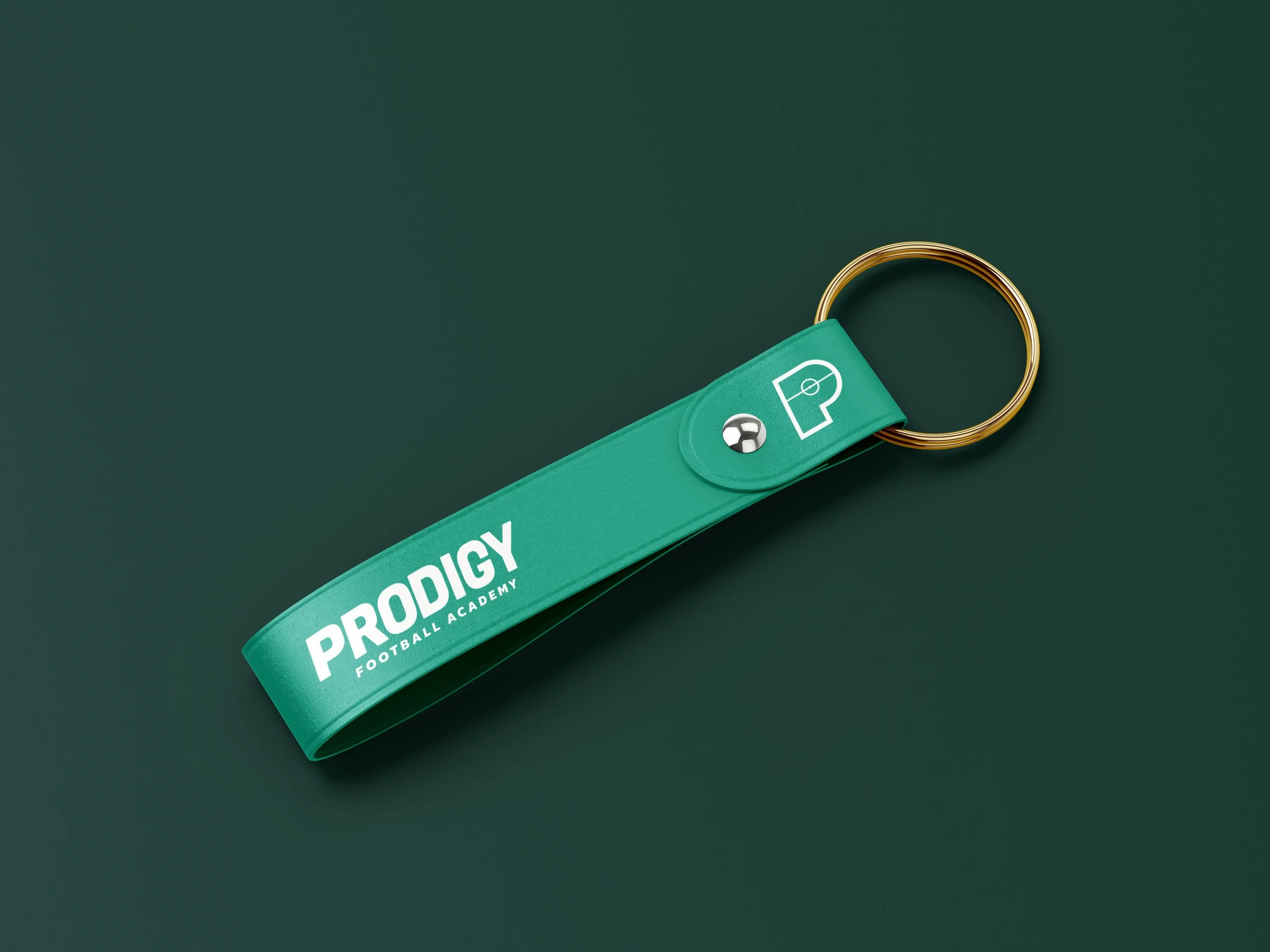
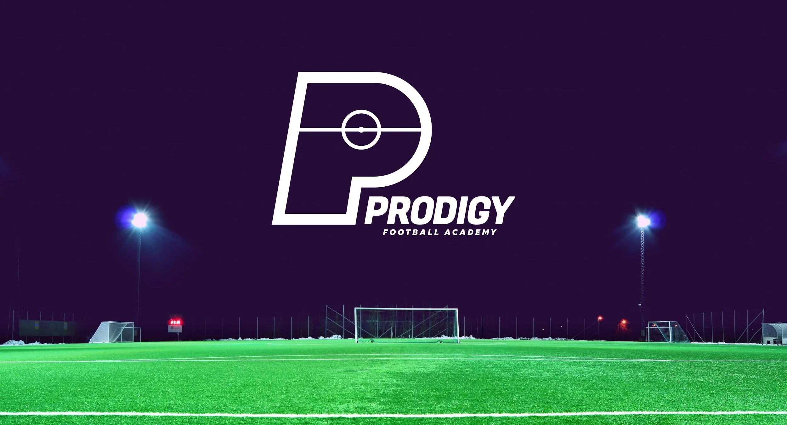
The visual identity draws inspiration from the energy and movement of football. The logo features a bold ‘P’ formed from the lines of a pitch, supported by a green and white palette that symbolises freshness, focus and ambition. The clean and dynamic design helps the brand feel professional, energetic and accessible to players of all ages.
This project allowed me to merge creativity with personal interest, treating it with the same process and discipline as a live client brief. The result is a brand that feels authentic, motivating and ready to inspire the next generation of footballers.